The DJ Techtools Blog Has A New Look

Welcome to 2017! This week we’re launching a brand new version of the DJ Techtools blog, redesigned from the ground up. It’s been a while since we’ve updated the look and feel of the site. This new version aims to be faster, easier on all devices, and to show you more helpful content. Keep reading for a quick overview.

A New Look

Out with the old and in with the new. The last time that the DJ Techtools blog got a refresh was in the middle of 2013 – almost four years ago. A lot has changed since then, so today we are happy to present a new version of the blog. You’re on it right now!
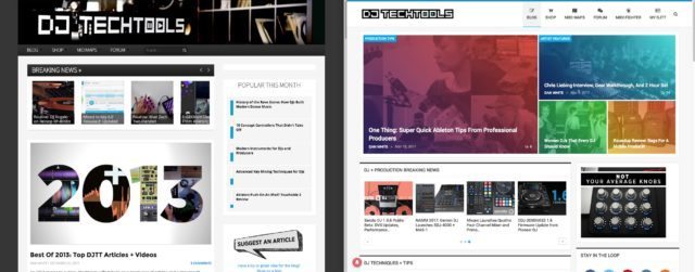
The last version of the DJTT site, launched in 2013 (left) and the current one (launched this weekend)

What’s Changed

  • Faster – This new iteration of the DJTT blog should be substantially faster to load for everyone on all devices. We’re still working on some optimization and caching this week, but overall it’s a much snappier experience.
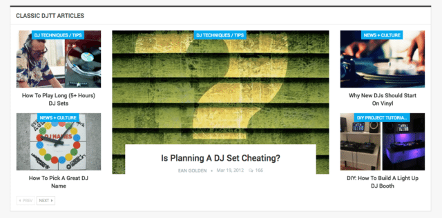
  • Show You Even More Content – Particularly on the homepage of the site, we wanted to show you – our readers – even more helpful and interesting content. One of my favorite sections is the Classic DJTT Articles (screenshot below) – which I’ve filled with some of the best articles from the many years that we’ve been writing posts.

  • Mobile is Better – At popular request, this new version of the site was built with our many mobile and tablet users in mind. In the past, many news articles weren’t visible on the homepage, and there were some design issues on blog posts. This new version feels a lot better to use on the go.
  • Easier Searching – Try it out for yourself – the new search bar in the menu at the top of the site loads results in line, making it simple to find what you’re looking for.
  • And more! – There are a ton of other small features on this new version of the DJTT site that you’ll discover as you use it. Load more posts in line on the front page, jump back to the top of the site with a single click, and other things that just make browsing the site substantially smoother.

Your Feedback!

We’re still working on the finishing touches of this new look for DJTT’s blog. What do you think of the new site so far? Take a few minutes to look around the site and see what’s new – then let us know what you think in the comments, below!


blogDesigndjttupdate
Comments (24)
Add Comment
  • DJ Xkaliber

    You guys need a feed that still shows the most recent content in list form. The old site was easy to tell what was new, this one, its all over the place and all I see is a ton of articles that I have already seen. The new look is good, but you don’t have the quantity to back it up, so it becomes really hard to find what are the 5 or 10 most recent stories.

  • Dubrifle

    more content please! like the in the days!!!

  • Jo Borges

    Ops

  • Jo Borges

    Absolutelly great visual. Full of info and clean at same time. I’m im Brazil and want to make a blog of my school, musicbit.com.br. If I can ask you guys, beside the absolutely good taste, what tools and themes did you used to make the blog looks amazing like this? Best regards.

  • DJ Roger Rog

    Please spend less time redesigning the front page and more time creating original content. I fell in love with DJTT because of the original content and fresh perspectives, not because of how it looked.

    What matters most is the creation of new and original content, please.

  • Be

    The colored gradients over featured images on the front page helps differentiate the images from each other, but I think the gradients are too opaque. It obscures what the images are showing off. Maybe try colored borders instead?

  • ?The Other Denzel?

    The UX, whilst doing a great job of maximizing the content displayed per page, is more difficult to navigate. Sure everything i’m looking for is easily accessible through the search feature, but I spend a lot of time on this website, and had developed a workflow that no longer works. I’m sure this will get better with time and continued use. On the upside, idk if you guys are using React or Meteor or whatever new frontend tech is out there in SF, but the website runs much MUCH faster.

    A much more pressing UX issue is the theme. I prefer a more “night” oriented theme on site’s where I spend a lot of time reading. There is waaaaaaaaay to much white on the screen, and this makes reading uncomfortable.

    Sincerely,

    A (MERN Stack) Javascript Developer / DJ

    • Kosta X

      I agree, especially in regards to the current “light” color palette. It definitely needs more contrast to make things a bit easier on the eyes.

  • Stephen Nawlins

    I don’t like it at all.
    According to all the other comments I will harvest a shitstorm…but this is what I feel.

  • MuWu

    great!! props to the good work!!

  • MMlazgar

    I like the new look, but I’m lazy AF so as long as there will still be a chronological feed of newest articles in one place, I’ll be happy.

  • zendoo

    Overall, it’s nice! The color saturation could be toned down a bit, but that’s a matter of personal taste.

    You still have the same fundamental issue of not publishing new content very often. I think if Classic Articles were above Deep Cuts, the site would be more appealing for people like me who visit at least once a day. On my 4k monitor, I have to scroll down two screens to see anything I haven’t already read. May I also suggest that Classic Articles pick random articles for every page load, rather than always being the same. It would help the site be more sticky for frequent viewers.

    Why is the subtitle for Deep Cuts ‘Even DJTT Articles’? I don’t get that.

    • Spacecamp / Dan

      Thanks for the detailed feedback! Notes below:

      >The color saturation could be toned down a bit, but that’s a matter of personal taste.
      On the top of the homepage section?

      >You still have the same fundamental issue of not publishing new content very often. I think if Classic Articles were above Deep Cuts, the site would be more appealing for people like me who visit at least once a day.
      We publish on average 4-5 articles a week – but that’s a fair point. We’ll do some testing and move around the blocks on the homepage to really get more stuff shown.

      >May I also suggest that Classic Articles pick random articles for every page load, rather than always being the same.
      It does – but it requires a hard refresh, I believe.

      >Why is the subtitle for Deep Cuts ‘Even DJTT Articles’?
      It should read “KEEP READING: THE LATEST DJTT ARTICLES” – you might be seeing a cached version.

      • zendoo

        >On the top of the homepage section?
        Yeppers. I can’t tell if you changed it, or I just got used to it, but it looks good to me now.

        >It does – but it requires a hard refresh, I believe.
        In FF, Edge, and Chrome, doing Shift-refresh always displays the same articles. But if I open the page at the same time in Edge and Chrome, I see different articles in this section. What loads now is also different than what was coming up 4 hrs ago. In Edge and FF, the center article now is “How to make your own DIY midi controller”. In Chrome, it’s “The dreaded DJ bio”, if that helps.

        All the little tweaks you made today really tightened it up.

  • Djg Stefan

    Really like the new look. Much more pro then before 🙂

  • n4Sphere

    looks and feels really good. the mobile version is way better then the old one. good work!

  • Kosta X

    I like the clean design, and like how fast articles & pages load once you click them. The homepage is a bit busy for my personal taste, but the biggest gripe I have is the lack of contrast to visually separate the “blocks” of information. I would suggest slightly darkening the light grey background a bit. Keep up the great work DJTT!

    • Tarekith

      Pretty much what I was thinking. The homepage is a bit busy and it makes it harder to find what you’re looking for. Like you said, just not enough contrast to seperate all that information.

    • Be

      It’s a bit better now, but I feel the background should still be a bit darker.

  • AfroDJMac

    Site is clean and beautiful looking. Another reflection of the awesome work you guys do 🙂

  • marquee mark

    wow – looks REALLY slick! You should redo the rest of the dj techtools site in this same style to make it consistent…

    • Spacecamp / Dan

      Thanks Mark – I’ll let the rest of the team know.