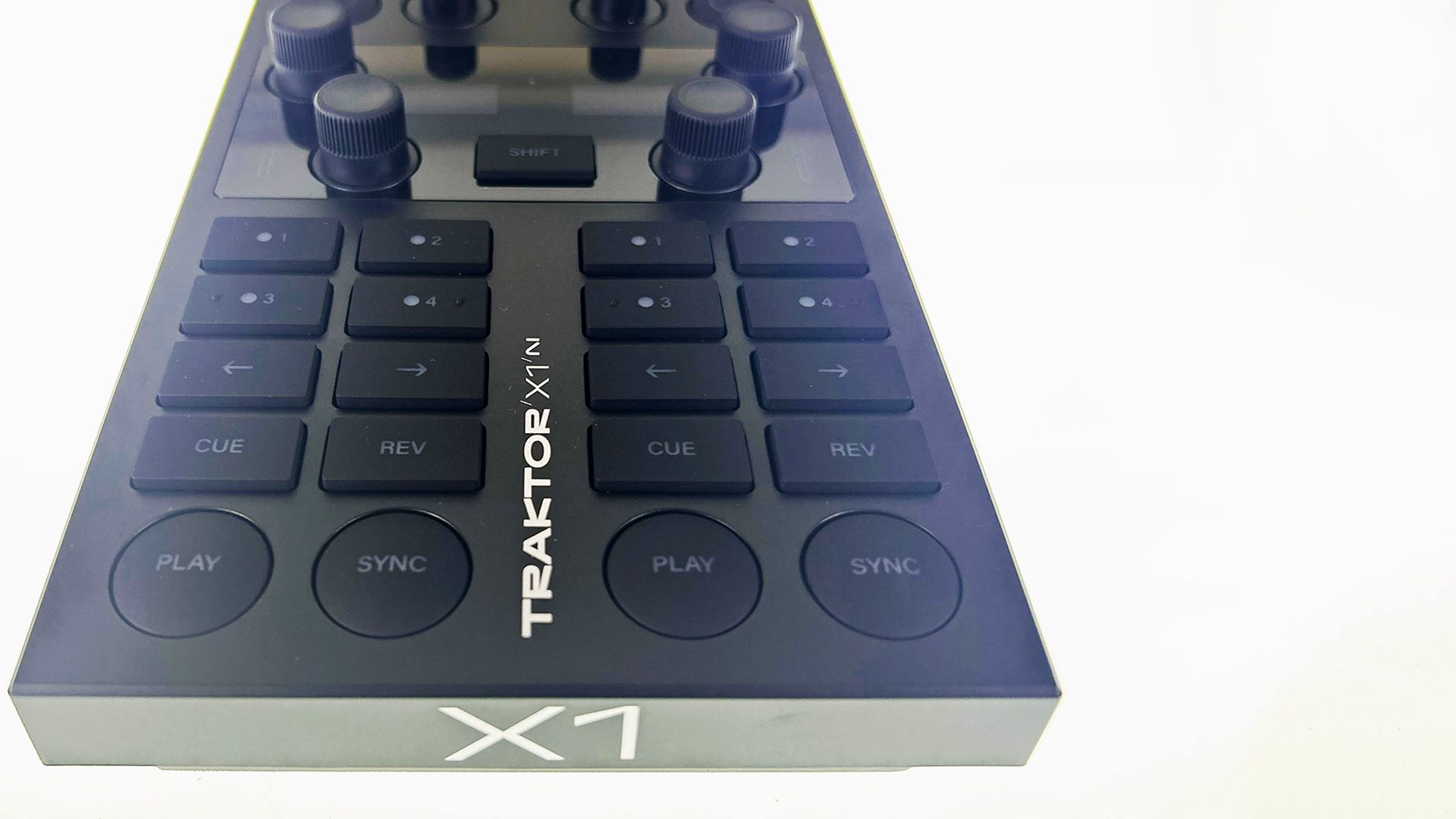
Want to build your own custom layout control surfaces on iOS? Besides the major players from Liine and Hexler, there’s a newer upstart, Midi Designer Pro, that is worth considering. Today, Chris Brackley gives the software a full review, including tips on using it in real world DJ scenarios and a critical eye to how design can influence the perceived quality of DJ tools.
When it comes to controlling your DJ (or other MIDI) software with an iOS, there are two big names which immediately come to mind; Hexler’s TouchOSC (also on Android, a big selling point), and Liine’s Lemur. Priced very cheaply, and at a premium, respectively, those two players seem to have the market pretty much sewn up between them.
However, there is a plucky little upstart which doesn’t get quite as much attention: Midi Designer Pro. A look at their site shows that the developers and community seem to be mostly focused on production hardware and software, but the app does have a lot of potential for DJ use.
CHOICES: THE DIFFERENT FLAVORS OF MIDI DESIGNER
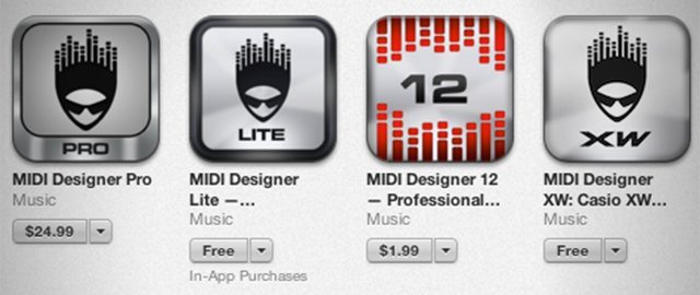
If you search the app store, there are 4 versions of Midi Designer available. The full version, Midi Designer Pro (MDP), at $24.99, works with both iPad and iPhone. That includes all the available features, and is the version I’ve been testing.
There’s a free version of the iPad app exclusively made for controlling Casio’s XW-P1 hardware synth, as well as an app called Midi Designer 12 ($1.49). That version is fully featured, but with a maximum of 12 controls; although that sounds like a bargain, unless you’ve got a very specific requirement for your controlling needs, I’d give it a miss.
Where Midi Designer really wins is with the free Lite version. Fully featured, but with huge (seriously, MASSIVE) adverts popping up over the centre of the interface regularly. That means it’s not an option for actual performance, but it also means you can get a real flavour of how useful the app is to you before you commit to picking up the full version, either by purchasing Pro outright, or through an in-app purchase.
That’s a massive deal – whilst TouchOSC is cheap enough ($4.99) that it’s affordable to try on most budgets, Lemur is $24.99, which is a lot to drop on an iOS app without trying it first. So kudos to the developer of MDP for offering a way to ‘try before you buy’.
WHAT’S GOOD?
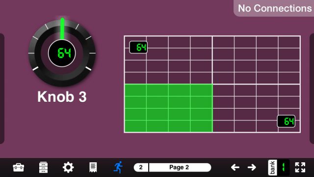
Eschewing custom Daemon or Bridge software on the PC/Mac side of the setup equation is a good move on the part of MDP. Setting up a wireless midi connection with Audio MIDI Setup (OSX) and RTPMidi (Windows), is very straightforward, and seems plenty reliable. There were times, during the iOS 6 era, that ad-hoc networks and iOS devices did not play nice together very often. Thankfully, those issues seem to have a faded somewhat with iOS 7. I had zero connection issues during my testing, using OSX 10.8.
The app also doesn’t require any additional design or editing software on the computer side, either. Everything is done solely within the iOS app itself, which makes creating and tweaking your own designs both immediate and intuitive.
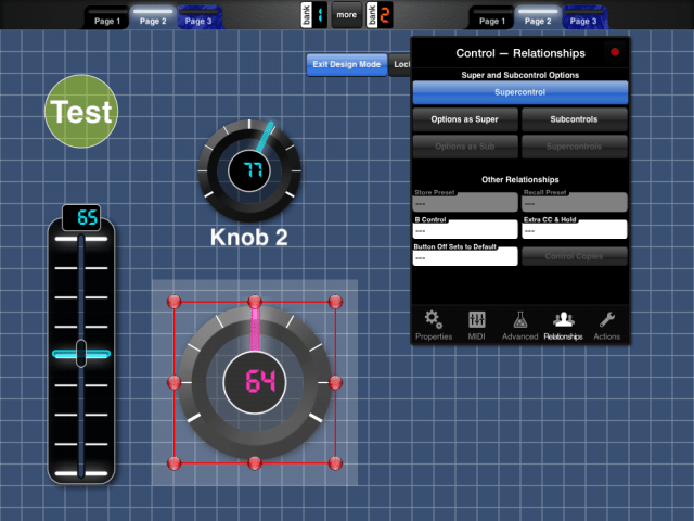
Advanced interactions like Supercontrols, where one control can activate a number of others, are handled through a simple drag-and-drop interface. Even for a novice MIDI mapper, the app should be very easy to pick up and use; unlike Lemur, which can seem almost deliberately obtuse at times, with scripting being the gateway to truly advanced features. In MDP, scripting is non-existent. For most users, this is ‘a good thing’.
Pretty much all the controls required for most DJ setups seem present and correct, with the absence of jogwheels. But I have yet to find a jogwheel mapping I’m truly happy with for either of the other ‘big two’, so I won’t hold that against MDP. Jogwheels are just tough, it seems.
Overall, the way the app lets users create layouts, as simple or as complex as required, is simple and quick. The user interface is clear and consistent, and there are more than enough options to satisfy the most hardcore mapping-heads.
WHAT NEEDS WORK
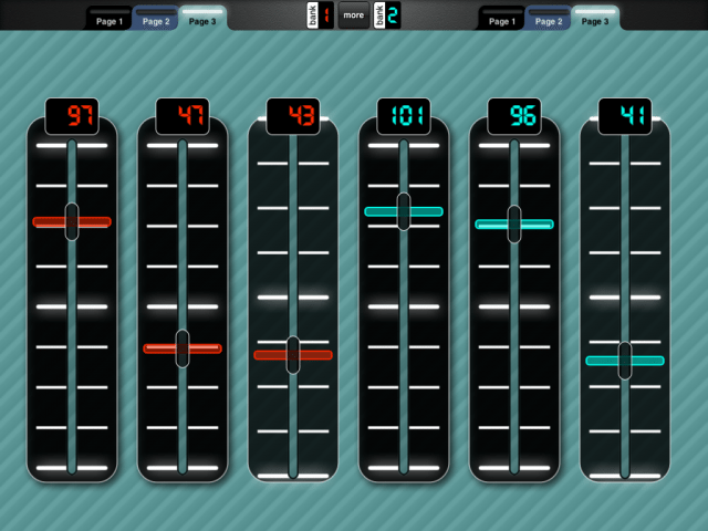
True story: I was aware of MDP in the past, but I had not even considered picking it up. Why? Simply because, to me, the styling of the app looks rather ugly. Not objectively ‘bad’; the aesthetic design doesn’t interfere with the operation of the app. But, subjectively, I don’t like the styling of MDP at all. Whereas Lemur and TouchOSC have settled on very similar minimalistic styles, MDP seems to be sitting somewhere between ‘future’ and ‘retro’; like a vision of the future, as seen from 1988. Things like the bevelling on the knobs and such, just don’t have the slick look of it’s competition.
Any talk of aesthetics is entirely a matter of personal taste, of course. I’m sure there are DJs out there who use Virtual DJ skinned to look like a pair of CDJ-1000s, or a unicorn, or the cast of CSI, or something, and they’re very happy. But as much as it’s wrong to judge a book by it’s cover, as a human being, it’s hard to fall in love with something which you don’t think is pretty. It’s easy to tone down some aspects of the design, like the textures, within the app, but the controls are the controls; there’s no getting around that.
The only other negative I have to mention, is that for some users, the hands-on approach to layout creation might not be what they want; scripting and suchlike is second nature to some people, in which case they’ll find Lemur’s ‘offline’ approach more suitable.
SUPPORT
One area where MDP does score points is on the support front. The developer, Dan Rosenstark, seems to be very responsive to customer questions, feedback and suggestions on the website. Plus, whilst the community isn’t as large as that over at Liine’s forum, there seems to pretty good engagement from users.
This is in stark contrast with Hexler’s TouchOSC, where, although things have improved recently, there have been times in the past where the app almost appeared to be abandonware. Time will tell if they can keep their renewed focus up; I hope they do, as TouchOSC is really the only option for Android users at this time.
Another aspect of support which MDP has got nailed, is tutorial videos. There are a ton of YouTube videos from the company detailing all the features and functions of their app; it’s comprehensive coverage, and is the reason I won’t go too much into describing the features in this review; if you want to know exactly how it works, head to their channel and get watching.
A REAL-WORLD ASSESSMENT
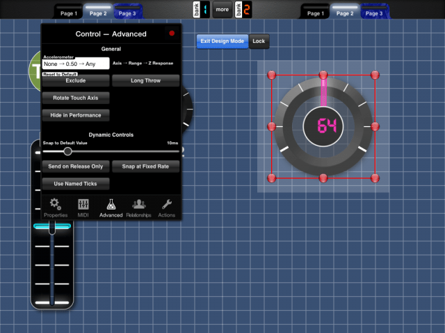
- Advanced control options
For DJs who are new to the world of MIDI mapping, and want to start using an iOS device in their setup, Midi Designer Pro is pretty easy for me to recommend in spite of its looks. Even at five times the cost of TouchOSC, the ‘all in the box’ paradigm of MDP makes it massively intuitive to use for a beginner, and the support from the developer is superb.
For more advanced users, however, MDP is a harder sell today. When I shot the video review, I was under the impression that Lemur was still $50 (the price I bought it for). On checking prices for this article, I see that Liine have now halved the price of their app permanently.
With MDP at 50% cheaper than Lemur, it would be a nice easy choice for many. $25 is a fairly hefty chuck of change (in mobile app terms), and MDP offers pretty much everything an average DJ could want from an iOS control app.
But at the same price, Lemur still wins out for me. Live Control 2 (a free control setup for Ableton Live which comes with Lemur) is absolutely killer. Plus, from a DJ perspective, there are a lot more user templates for DJ software already available online for Lemur. MDP’s forum has a decent selection for production gear and software, but precious little for DJs. That doesn’t mean I’m dismissing MDP out of hand – for people who work best in a ‘hands-on’ way, it’s really good. Plus, like any good app, it is constantly evolving and being upgraded, and the developer appears to be very responsive to suggestions and ideas. So even if you feel like Midi Designer Pro might not be the app for you today, it’s definitely one to keep your eye on.



![ROLI’s Seaboard RISE 2: seamless integration into the expressive world of MPE [REVIEW]](https://s11234.pcdn.co/wp-content/uploads/2023/11/Screenshot-2023-11-16-at-5.02.41-pm.png)
