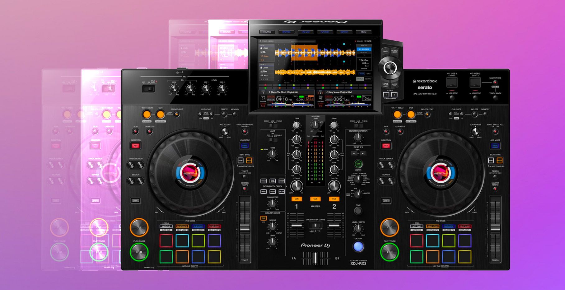
The XDJ-RX3 is the third edition of Pioneer DJ’s all-in-one series, a much-appreciated member of their DJ gear family for artists who appreciate its portability, affordability (we can’t all pay to have the dream of a mixer and three CDJs at home, as much as that’d be nice, right?), and features that have developed over the years. The first XDJ-RX was originally released back in 2015, and it was an interesting (and, perhaps quite smart move) pandemic release to get its third iteration in November 2021.
Dan and Rachel, two of our editors here at DJ TechTools, spent some time getting to know the XDJ-RX3, exploring its features, and seeing how it truly stacked up between the two of us (who are DJs/artists ourselves). Worth noting, too: Dan owns an RX2 and Rachel owns an RX, so we’re both quite familiar with the previous systems and – arguably somewhat attached and quite appreciative of the all-in-one series as they have progressed over the years. Rachel has had her RX for almost as long as she’s been DJing, and was intrigued about the concept of moving to a newer, larger edition of the series with the RX3.
With that – Rachel here, and I’ll be diving into our conversations and observations about the RX3. Read on, and let us know where you agree or disagree.
Tech specs
From a technical perspective, let’s take a quick look at the XDJ-RX3’s offerings.
- Inputs:
- Two line (RCA) inputs
- Two phono (RCA) inputs
- Two mic inputs (one XLR, one 1/4″ TRS jack)
- Two AUX inputs (one RCA, one 3.5-mm stereo mini jack)
- Outputs:
- Two master outputs with an XLR and an RCA each
- One booth output with two 1/4″ TRS jacks
- Two headphone jacks – a 1/4″ stereo jack and a 3.5-mm stereo mini jack
- USB inputs: The three USB ports come as b) two of your typical-of-RX USB Type-A two ports that live in the top right corner of the gear, and b) a USB-Type B input to connect your laptop with rekordbox’s Link Export mode.
- Weight: The RX3 weighs a hefty ~20.5 lbs, or 9.3 kg – yep, a twenty-pound piece o’ gear. That said, it’s still easier to carry than a full gear setup of mixers + CDJs, and ideal for someone on-the-go who wants the flexibility of moving quickly with one item.
- Dimensions: 28.7″ x 18.5″ x 4.7″
- Power Supply: AC 110 V – 240 V, 50 Hz / 60 Hz
- Software compatibility with rekordbox & Serato DJ Pro: The RX3 is compatible with rekordbox addLINK, meaning that it can play rekordbox-analyzed tunes trom your USB via Export or you can link up your laptop and use the software’s Link Export or Performance mode via USB-HID control. It will have free accessibility available for Serato DJ Pro addLINK ++ make sure this hasn’t happened already as well. It’s also a Hardware Unlock device, so you can use rekordbox Performance addLINK mode for free.
Our take on the weight & size increase:
One observation we noted here is with regards to the RX3’s physical size: it’s a twenty+-pound piece o’ gear. That said, it’s still easier to carry than a full gear setup of mixers + CDJs, and ideal for someone on-the-go who wants the flexibility of moving quickly with one item. Compared to the RX2, though, the weight doesn’t differ too much at all – the RX2 was 20.05 lbs, and the RX3 is 20.5 lbs. The dimensions are slightly larger as well – coming in at 28.7″ x 18.5″ x 4.7″ compared to the RX2’s dimensions of 28.7″ x 17.5″ x 4.3″.
Coming from Rachel: as a smaller individual, the RX is already pretty hefty in terms of weight even with a carry backpack and it weighs 17.64 lbs. Interestingly, I found that that the weight of the RX3 really seemed much heavier comparatively because it’s more disproportionate with the larger screen, and that made it more challenging to carry – which I found to be somewhat deterring. The screen makes the RX3 more top-heavy, so the ability to carry it became a bit more challenging given the uneven weight dispersion. However, as I spent more time with the RX3 I began to appreciate the screen size for its larger swath of capabilities and the weight increase began to feel less relevant when it came to considering moving onto the new gear.
Checking out the new features: bigger touch screen, quick track access shortcuts & more
We explored some of the key features and upgrades to the XDJ-RX3, testing out their functionality and whether they’re worth the upgrade. The main ones we’ll look at here are:
- The 10.1-inch touch screen
- New navigation & track access features: Playlist Bank and Touch Preview
- Updates to the track view: Phrase Display and 3Band Waveform
- Track info and album artwork displayed on jog wheels
- A larger offering of effects – matching those available on the DJM-900NXS2
A huge, 10.1” Touch Screen: too big, or a welcome increase in size?
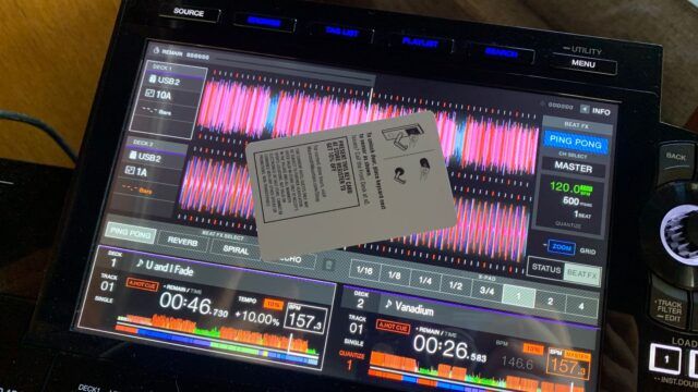
The 10.1″ touch screen echoes a similar move to screen size increase made with Pioneer DJ’s CDJ-3000s, but even bigger – the 3000s offer a 9-inch screen, and this one has over an inch on that. It’s now the largest screen on any of Pioneer’s all-in-one systems since the RX2 was 7 inches, and this takes it 3 inches further. The screen spec upgrades go beyond that, too; the resolution has been kicked up to 1280:800 + frame rate increased as well.
There’s no doubt that the screen size was a big decision on Pioneer’s part, and a risky one at that. Some artists may love the larger screen space, but it’s a polarizing enough move that many may deter from it.
Rachel: On my part, I’ll start by saying that I don’t love a massive screen. It was one of my least favorite parts of the CDJ-3000s when I played with them for the first time as well. It can be distracting when I want to focus on mixing without staring at the bright screen in front of me, but I’ll note that I just generally avoid big screens as a DJ as I never really enjoyed playing with a laptop. But hey – maybe you’re a DJ that likes the lights n’ brights, and the bells and whistles that come with it. As I spent more time with the RX3, I began to care less about the size increase since it just took some getting used to. And whether your vision is getting worse as you get older (it happens), you like the sorting capabilities, or you like the visual guides of album art etc. – there are reasons to love the screen, too.
Dan: At times, the screen size seems to be compensating for a bloated, non-intuitive user interface. If you could do more with less, and had Pioneer DJ really made their user interface super clever, they could have probably gotten away with a screen size somewhere between the RX2 and RX3. It almost feels like a screen size that was intentionally designed for four deck mixing – but sadly, Pioneer DJ doesn’t seem to ever be willing to give us that in an all-in-one. Not yet, at least.
We’d love to know: are you a fan of the screen or is it too much?
Touch screen capabilities
Rachel: I’ll preface this by reiterating: it’s great to have more touch screen ability – there’s no doubt about that. The biggest issue I ran into, though, was that it seemed like Pioneer DJ attempted to step towards the full touch abilities of the CDJ-3000s without quite getting all the way there. This was fine generally once I figured that out, although I found it frustrating when I could touch to select certain things but not others. You can scroll through your typical artists, albums, playlists etc. and choose to load to deck one or deck two; you can type key words into your search bar; you can’t, however, touch through all of the on-screen windows like Utility, for example. The biggest touch access I was hoping to see was the ability to sort your library while browsing via touch like you can on the 3000s, which isn’t available on the RX3.
Regardless – some is better than none.
Dan: It’s somewhat of a shock that Pioneer DJ still seems to think that “they know best” in terms of touch. The reality is that Denon DJ has done touch interfaces far better by emulating the experience that everyone expects on a touch device: iOS-like. The resistance to doing that on Pioneer DJ interfaces reflects an overall relative clunkiness present in the UI.
Navigation & track browsing process
The new features intended to improve the navigation flow and make for a faster browsing and searching process include:
- Playlist Bank
- Touch Preview
- 12 tracks viewable at a time on the browser screen – an upgrade from 8 on the RX2, with the intention of shortened track scrolling time
Our take: When it comes down to it with navigation – which is obviously one of the core parts of the process of using the actual gear, and therefore one would think should be the smoothest process – things are oddly hidden and more options have seemingly made things harder to find. For instance, take the info button getting removed to a touch-only function, the sort-by functionality only being clearly accessible when you’re inside a specific playlist etc. In general, it feels again like more things were added, but without an information architecture plan to the user interface.
Playlist Bank
Rachel: Playlist Bank gives DJs the ability to pick four playlists and pin them into this new “bank” for quick access. For someone with a ton of playlists on my USB, it’s an incredibly nifty way to save the handful of playlists I may want to reference on any particular occasion like a gig out or night playing with friends. The amount of time so many artists – very much, myself included – spend getting lost in their folders of music trying to dig for that perfect track is probably more than we’d like to admit (I can’t be the only one, right?). This is a huge lifesaver in that realm.
Worth noting: upon initial exploration, I realized that the Playlist Bank options are only findable if you hit the “Playlist” button above the screen – they are not viewable if you try to navigate to playlists using the left-hand dashboard scroll. This is somewhat confusing as it’s not immediately intuitive, but once you nail that flow it’s straightforward.
With that – you can set these up pretty easily, and pin them into this new “bank” located on the left-hand side of the Playlists screen. To choose: select the playlist of your choice and then immediately click BANK 1 / 2 / 3 / or 4 – whichever you’d like to use. You can double-check the playlist actually stuck just by clicking into it, and you’ll see the name at the top. To delete it, just hit the “DELETE” button on the bottom left of the screen while in Playlists, and you’ll see X’s pop up on each bank.
You can’t register a playlist to multiple Playlist Banks, though – not that you’d need to per say, but always good to keep in mind.
Touch Preview
Rachel: Another feature pulled from the CDJ-3000s, Touch Preview lets you click on any part of a track’s waveform once you’ve loaded it into a deck give it a listen. Not sure if it’s the right track for the moment? Remember a particular part of the track you want to hear before playing it fully? You’ll save a few moments and track-loading steps to hear it before committing. It’s another nice element of the RX3 that aims to save DJs time on exploring and give back more time to actually playing – and I found that not needing to manually fast-forward through a track or jump to a cue point (if I even had them on that particular song, which I oftentimes don’t) made it easier to skip through potential song options at a quick pace. It was a nice benefit for quick movements when I wanted it.
Visual features for accurate mixing: Phrase Display and 3Band Waveform
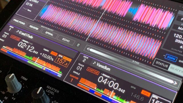
Both Phrase Display and the 3Band Waveform are visual features within tracks that give users an array of metadata intended to give context for strong mixes. Phrase Display will show the intro, chorus and bridge on the overall waveform; 3Band Waveform shows the high, mid, and low frequency bands via different colors. You’ll need to run your tracks through rekordbox analysis, though, in order to use these features fully.
Our take: They’re features that are nice to haves, especially if you’re a fan of leaning on the screen heavily for metadata info and watching tracks to work on your mixing. I (Rachel) particularly don’t find them overly useful as I try not to focus too much on screen usage while playing, but there’s no harm in them and I can imagine that those who get excited about the metadata capabilities may enjoy this angle. I will say that with my current RB6 rekordbox subscription (and perhaps that my USB hadn’t been updated in a minute), most of my tracks were not showing either feature – but that could very well be my USB or software version.
Performance tools: Pad Status Display and the Beat FX Bank + X-Pad
- Pad Status Display: With Pad Status Display, artists can view the Performance Pad mode to know exactly what to expect before hitting a pad.
- Beat FX Bank and X-Pad: Artists can save their four favorite effects to the new Beat FX Bank to quickly activate the effects with a single touch. Also, for the first time ever in an all-in-one DJ system, the X-Pad integrates into the touch screen, giving artists a simple way to apply complex-sounding effects by swiping their finger from side to side.
Our take: The Pad Status Display is an interesting approach to be able to triple check what you’re about to do – for instance, when doing a beat/loop move, how many beats am I moving this by? That said, it feels again like a result of a disconnect between the pad-based experience and the standalone DJ setup. Every time I use the pads, I feel like I have to check the screen. That sucks from a muscle memory standpoint – it trains you to use your eyes instead of your ears and muscle memory.
The X-pad moving to the screen also is reflective of a move away from physical controls, and I wish it were still a physical thing instead of an independent touch-interface. Being on the screen means you always will have to check to make sure it’s there and ready to use, which isn’t really what you want for a performance tool. You want it to be always ready. More dedicated hardware controls would do this. I wish that more of the design choices of the V10 were on this device, but instead it feels like the Rekordbox DJ software team designed this controller with a “let’s just put it all on the screen!” mentality.
Jog wheel track info displays
Rachel: Some love this, some hate this. Seeing the album artwork is a nice touch if you’re a big visual memory person – obviously it’s not the most ideal way to appreciate an album cover, but it’s a good identifier if you’re quick to match a color with a track in your memory. I appreciated the ability to also see details like the jog mode, which channel is Master, if Sync is on etc. as well.
The Feeling Adjust control is a nice feature, too – if you’re touchy about the weight of the jog wheel, it’s a simple enough way to adjust it to your personal comfort level.
Effects galore: Beat + Sound Color FX from the DJM-900NXS2 & Release FX via Performance Pads
Additional Beat and Sound Color FX
Rachel: The extension of effect capabilities on the RX3 to include the entire range of 14 beat FX and six Sound Color FX from the DJM-900NXS2 is definitely a tally in our “pro” column, as being able to take advantage of all the effects without needing to own an 900NXS2 is a big win. Now with 900NXS2 favorites like Vinyl Brake, Helix, and Ping Pong, it removes much of the limits artists who love using effects in their sets may have had when using the smaller amount of effect offerings on the RX or RX2. If you’re playing out often on an 900NXS2 but practicing at home on an older RX, you may have found yourself only getting to know a few of the effects – and this changes that ability to utilize more of them, more often.
Release FX with the Performance Pads
Eight release effects are accessible via the XDJ-RX3’s Performance Pads: Vinyl Brake (Short / Long), Backspin (Short / Long), Echo Out, Build Up, Mute, and Ducking.
Dan: Release effects are not made for pads, they’re best executed on the RMX-1000’s toggle lever, and it’s a shame that that design is not implemented on top-of-line units like this one. On the pads, they are non-intuitive, require triple checking on the screen what you’re using, and generally lack performance-style playability – they more feel like identical results every single time.
Other features we dug
- The new REC option on the dashboard – which you’ll find on the bottom left of the home screen options – was a pleasant surprise. The short of it: you can find the recordings you create and record onto your USB with the RX3 here. If you recording directly from the XDJ (which, I will add, is one of my all-time favorite capabilities of these all-in-one controllers – it’s a hell of a lot easier than needing to plug in a recorder, hope your SD card hasn’t failed you, and cross your fingers that your batteries won’t die) with the MASTER REC ability. You’ll get the file here, and in the PIONEER DJ REC folder viewable on your laptop when you plug the USB in. Easy.
- Repeat Mode: Yeah, we’ve all been there – you need to run to the bathroom mid-gig or step away for a second. The new repeat mode lets you keep a track or playlist on repeat – a good back-up option in case a track runs out, and also a helpful tool if you want to keep music playing during soundcheck. The playlist-repeat option seemed like a smoother replacement than keeping your USB on auto-play, which tended to be my go-to option for a similar use case with my original RX.
- Improved wheel rotation responsiveness – always a fan of a more sensitive jog wheel, so it was a much-appreciated upgrade to feel like there was more flexibility and accuracy with beatmatching here.
The last word: is it worth the $2k price point?
Sitting at a pricetag of $1,999, the XDJ-RX3 is $200 more than the XDJ-RX2 was priced (which ran for $1,799). As much as it may hurt anyone’s bank account to fork over $2k for DJ gear, I will say that I appreciate that it’s still under that 2k mark even with the addition of the features that point the gear in the direction of being more on-par with a mixer-and-CDJs setup. Worth noting as well that the RX2 is now discontinued, so if you’re looking for an all-in-one, all signs point to the RX3 unless you’re buying secondhand. Whether that’s fortunately or unfortunately, we’ll leave that to you to decide.
The features in the RX3 are, naturally, a mix of pros and cons for both of us. There are more ways to quickly navigate through your library, record mixes, use visual info and take advantage of quite a few more effects. That said, the navigation is a good step in the right direction but, again, is somewhat clunky; there’s room for improvement, but we appreciate the concept. The increase in screen size may be a make-or-break decision for any DJ depending on how much you appreciate a screen (or don’t) as well.
When it comes down to it, we find that this gear is a decent upgrade to its predecessors without too much of a price hike, and we look forward to seeing what they’ll improve on with future updates and releases.
Now, we want to hear from you – what do you think? Have you tried it, or would you consider doing so? Why or why not? Sound off in the comments below.
You’ll find the Pioneer DJ XDJ-RX3 in our shop for $1,999. It’s currently on backorder, but you can sign up to be notified when it’s available or purchase now to be one of the first to get it once we have it in stock again.


