The Next Ableton Interface: Two Concepts

We’ve seen a number of interesting mockups come out from designers over the years imagining the future of their favorite piece of dance music technology. Today we’re featuring two redesigns of Ableton Live that take on the challenge of modernizing the familiar-but-aging interface of the DAW.

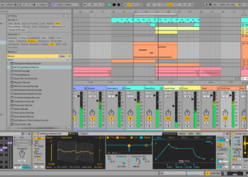
Vlad’s Flattened Ableton Interface

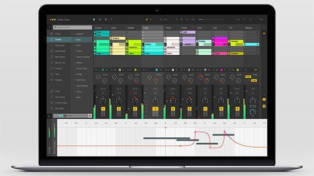
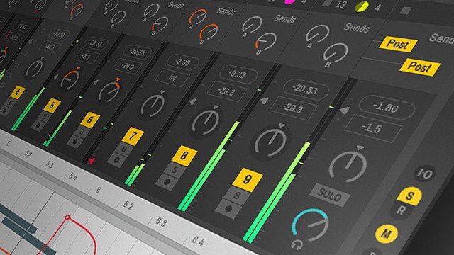
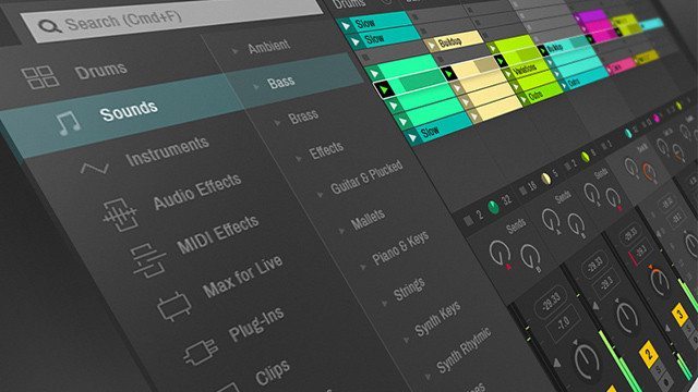
This one showed up in our inboxes over the weekend. Polish designer Vlad Shagov took on the challenge of creating a new iteration of the Ableton Live interface, and came up with this more interesting and modern take on the familiar UI.

Vlad writes in his descriptions:

I’m a huge fan of Ableton products. A couple of months ago I had a bit of inspiration and I tried to make my version of the Live’s interface […] Of course many elements are missing. But it is just a sketch which was inspired by this awesome Ableton product!

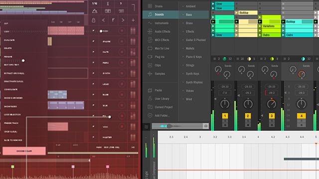
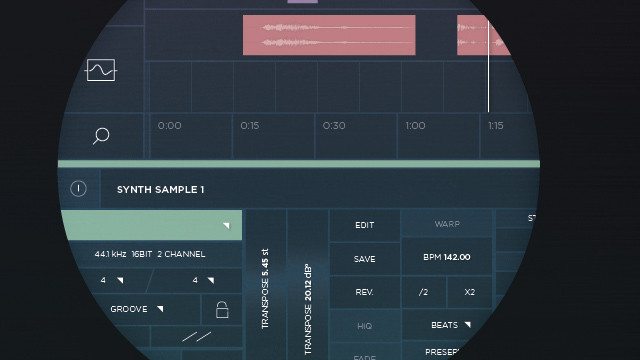
Jonathan’s Ableton UI Touchscreen Redesign

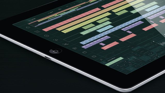
In a similar vein, German designer Jonathan Baruc tackled the entire Ableton interface in his own redesign, but instead of focusing just on the overall look and feel, he wanted to make sure that the new interface would be useful for touchscreen devices. He included an overview of how different gestures could potentially control the interface on a touchscreen:
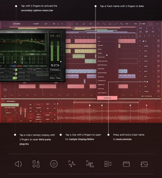
Jonathan writes:

[This is] a concept redesign of the acclaimed Digital Audio Workstation, Ableton Live. [The design is] optimized for a future of sizable touchscreen surfaces as well as tablet size.

We speculated back in early April on a ridiculous feature set that might appear in Ableton 10, but this these concepts of functional interface improvements might be more likely to make it into the next version of the software than an olfactory synthesizer.

Would you like to see Ableton’s user interface redesigned? Share your ideas in the comments below.

Abletonableton livealbeton live 10Designfutureinterfacevlad shagov
Comments (22)
Add Comment
  • Ashley R.

    Logically, the design would resemble the screen on the Push 2, if not simply because Ableton would want it to match. So those mockups likely aren’t far off.

  • itchy

    i love the ableton interface. they can create different skinsor preset layouts but the current layout in 9.5 is what keeps me interested. its simple clean and everything is there to focus on the art . i really hope they don’t change it.

  • ItsWesSmithYo

    that flatter one is sweet, bit like some of the skins I’ve seen….particularly fond of the area around the browser…that could use some functional work too (long list im sure) like being able to read smart folders on mac, among other things would be awesome…and why not the iTunes library while we are at it;) cool stuff…Ableton Rocks….

  • calgarc

    DROOL….

  • Preston

    Really cool

  • BoomDraw

    I think this whole issue/debate about how a software’s interface “looks” is so largely irrelevant compared to the importance of the actual features and user experience. It’s the same stupid argument people use against DJ controllers and Midi controllers, as in… They’re tools, use em. Who cares if it’s plastic? or if it “Doesn’t look as professional as Pro Tools” come on guys

    • Dima Key

      Personally I don’t think Pro Tools look professional. I think it looks prehistoric:)
      Anyway I agree that sound features are more important in DAW but interface cannot be left aside. Working in the studio that looks pleasing to me and in tune with my mindset is very inspiring and it has a huge impact on my productivity. Whereas working in the area that is complete clusterfunk of colours, features and menus sucks all of your energy and inspiration in seconds.

  • B

    So, actually everybody wants ableton 10 to look like bitwig???? Glad i use that.

  • ithinkmynameismoose

    I’ve said for ages now I want Logic X’s looks with Ableton’s functionality. I love the flattened look. It’s sleek and professional looking. That would be much nicer to make music on than the current rather simplistic look.

  • vik

    Seriously the touchscreen redesign, i don’t know for you, but me i read “Horizontally” and from left to right perhaps it can work with the martian

    What a loose of time and money… New feature is a better way to improved your workflow.

    ps. With the Flat design your EQ trend too be flat !!!

  • Luiz Zen

    Oh Lord! Please Ableton, do NOT ever go for the flat-child-poorly-designed option (I think the example from Jonathan Baru). It would look like Apples Yosemite design, which seems sometimes as if a silly child has designed it.

    Hope it does not receive the same UX as the touchable (in iPad) either, it is horrible!!

    • Dima Key

      Yeah if Ableton looked like that I would jump off of that train, seriously. Huge part of Ableton’s charm is it’s intuitive minimalistic design. And that… whatever that is… looks like Jonathan was on acid when he made it.

  • Jake Bergeson

    Really really digging that flattened interface. I use the ‘Disco’ skin in Ableton 9 right now, and it has a similar aesthetic, but still not as sleek as that flattened one!

  • sam

    That touch interfaces would look great on the TouchAble app

  • Egg Foo Yxng.

    I think this would be a great design for Ableton, everything seems clean and neat. I think it also makes Ableton look more professional for use in big studios, allowing less people to be turned off my it’s “basic” look. Love it!

  • xisam

    I care about new interfaces, if they improve the workflow and ux. Its a nice approach on first sight, but it’s really hard to judge an interface based on a few action shots, which leaves the judgment up to the choice of colors and such. I like the dark version, because I prefer dark interface as they are less stressful for my eyes. Modern in this sense would mean thinner lines, thinner fonts and more saturated colors. Makes it overall harder to find things. In the last shot its even hard to tell which button is supposed to be active, inactive, disabled etc. The Interface might seem outdated for users to see ii every day, but its a very functional design and it works really well. Seeing this shot from the ipad app, the layout looks really small and hard to use with my finger. I could see the usage of the ipad more like a remote, to support certain features like the ableton lemur template (at least thats what I want 😉

  • QCube

    Would be nice if the interface would work good with touch, but everything more isn’t that important. In my opinion it should be not much work to change the look of the interface. The Layout should stay the same, its good how it is. I would apreciate more function in the lower versions of ableton (Standart).

  • plus1

    Sorry but who cares about the new interface. More features, workflow improvements, contents, stock instruments, etc… are what’s matters, not the interface.

    • lokey

      well, interface improvements also lead to workflow improvements.

      • Dorian James

        I agree. I love the new features of 9 but it’s simplistic minimal design has become bulky and cluttered. Although the embedding racks inside each other is a powerful tool, it is very hard see. The new browser seems to take up more room. Long lists in a rack don’t seem to expand to see more. Also, The font is very hard to read in general.