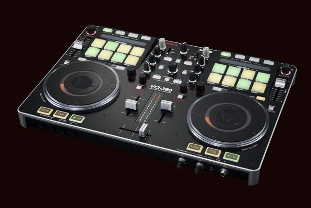
Itch is a much misunderstood beast. Specifically designed as an integrated solution in conjunction with hardware developers, its total 1:1 control plug and play usability is what’s at the centre of its charm. Whilst it looks the same on the surface, under the bonnet Itch is tweaked and perfected for the specific controller it ships with.
Itch 2.0 has been a long time coming – too long, probably. Serato have taken on board a lot of user comments, both encouragements and lamentations, and finally bestowed the brand new, sleeker and stronger 2.0. Whilst we’re glad of the new changes, and particularly excited by some, it’s not all wine and roses… here’s our honest opinion.
WHAT WE LOVE
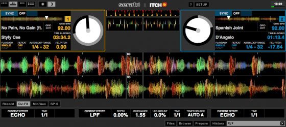
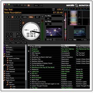
- Colour scheme and new views. It’s felt a little bit like Itch’s drab grey colour scheme has been something Serato has stuck with simply to differentiate between it and Scratch Live, much to the detriment of Itch. First impressions do count, and it’s great to finally see Itch looking sleek in a little black number. It’s also nice to be able to switch the view to look more like Scratch Live.
- SP-6 Sampler. Scratch Live beat Traktor to the punch when it came to sample decks, and since everyone else caught up it felt a little bit like Itch was in the lurch. The SP-6 is now in Itch, which will lead to some cracking new controller developments with real focus on sample decks – something that many of us consider an afterthought when with just a little bit of regimentation (read considerable R&D on the part of Serato and their hardware partners, something that organisations like Novation, Numark, and Allen & Heath have proven they’re not shy of), they could be a major player in a revolution in live performances.
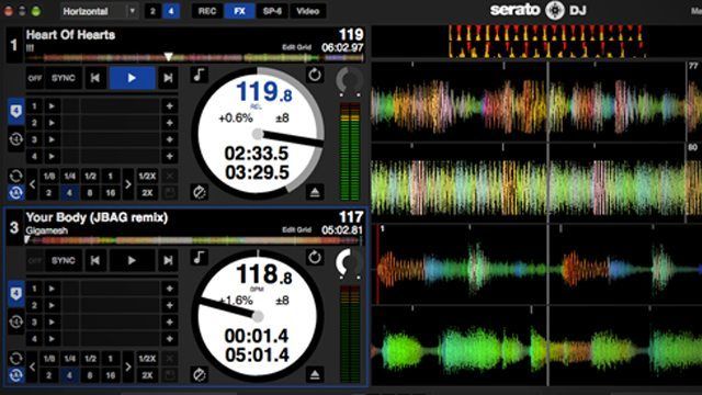
- Four Deck Support. A bit of a no brainer, this one: Four deck support is what people are coming to expect from controllers, and now Itch is no different. Considering that the decks and sampler are discrete units in Itch, four deck support won’t come at the cost of the sampler and vice versa, either. Itch 1, Traktor Pro 0?
- Better sync management. Nobody’s completely decided on how they want to approach sync yet, with different approaches having their own strengths and weaknesses. Itch 2’s new approach is a definite improvement on the old, though, with proper beat sync which can easily be dropped into and out of, making it easier than before to lock deck timing together very quickly mid mix.
- Better Library Management. Smart crates are the best thing to happen to libraries since tagging, and Itch’s new found ability makes intelligent management a breeze. Add to that the way it figures out music stored on external drives much better, which is great for laptop sharing moments, and the crates system that Serato employ could very well be our favourite.
WHAT WE DON’T
- Still No External Controllers. Adding features to Itch is all well and good, but it’s largely a move that will please new users and leave existing ones out in the cold. We’d love to see the ability to hook up a pad controller or MIDI Fighter to sit along side the Itch controller and control the SP-6, for instance.
- Still No Remapping. It might go against the entire design philosophy of the Itch platform, but an opt-in reconfiguration process would be an excellent way to integrate the SP-6 sampler into older controllers, or maybe even some more complex mappings above and beyond what was originally envisioned.
- Same old effects. One thing that could be updated and retrofitted onto just about all controllers is a better effects section, because really Itch’s main weakness is its audio mauling capabilities. Scratch Live’s Super Knob implementation still isn’t quite as in depth as what you can make Traktor Pro do, but it’s not that far off and it’s something we’ve really got our fingers crossed for in a future incarnation of Itch.
- Slightly inefficient screen usage. Having to select between viewing the SP-6, the effects, and the recorder is frustrating when the library section will expand indefinitely. The new views are great, but we’d like to have the ability to have both the sampler and the effects on the screen at the same time.
ALL IN ALL
What we’ve always really liked about Itch is how simple it is to set up – the accompanying hardware feels much more like standalone equipment, and to be honest 80% of the setup of a controller isn’t the mind boggling complex modifier based trickery that we love so much, it’s the mundane setting up of standard controls, not least figuring out where they should all go on a controller.
What many of us bemoan is quite how stubbornly the Itch software holds onto control of its workings compared to most other DJ software that allows varying degrees of customisation. We get that Itch is designed very precisely for the controller it comes with, but now more than ever, with the addition of the SP-6 sampler, we wish we could plug in an additional controller – if anything just to control the SP-6.
Finally, Itch performs better than Traktor when it comes to platter control (at least, with most controllers) but it really lags behind on effects, Itch’s offering seeming, for the most part, basic in comparison (we’re extremely impressed with the Novation co-developed Slicer mode, although we’re not strictly placing that in the ‘effects’ category. That said, it does go to show that when effects and manipulation options are considered in the design stages, they tend to have more direction than simply throwing more, more and more into the mix). Here’s hoping a future 2.x update will integrate Scratch Live’s Super Knob implementation into Itch – that’d be fantastic. As it is, we wouldn’t hesitate to recommend Itch to a user that wants to dive right in and for whom complicated mappings are a turn off rather than a must have. One thing’s for sure – we’re excited to see what the new breed of SP-6 integrating four deck Itch controllers will look like.


