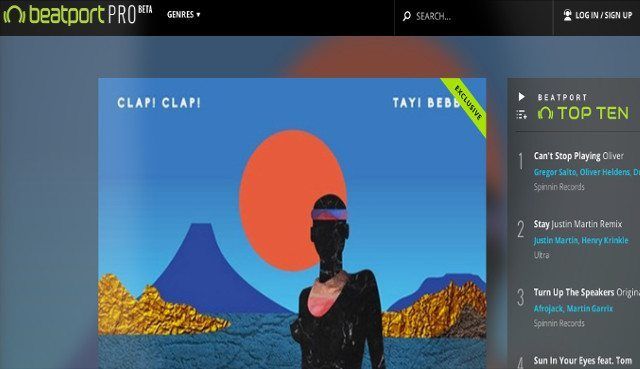
Beatport has been around for 10 years and has become the most prominent online music store for DJs. While the site has proved to be a successful platform, there was an apparent need for a site redesign and UI configuration. Beatport has announced today the released beta version of their new online music store, renamed Beatport Pro. The new design features a much-needed update to the UI with mobile optimization and more efficient crate digging functionality. Read more inside
Crate Digging 2.0
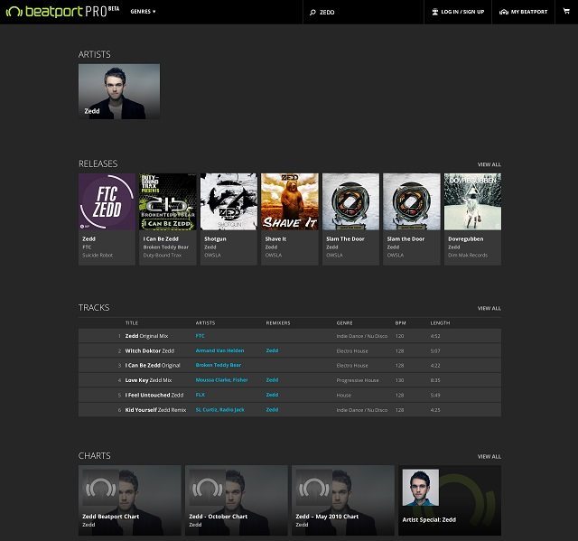
Searching for tracks online can be very difficult at times and Beatport Pro provides new ways of searching through the millions of tracks to find that one gem you heard in the car or the artist whose single you can’t remember the name of. The major improvement is that the search results start popping up as soon as you type two characters into the search box. The results are also delivered much quicker than the old site due to improved web design behind the scenes. Throughout the course of the beta, Beatport is going to be improving search results as more users use the new website. The goal is to make finding tracks before a set much easier than before.
Be sure to read DJTT’s guide on how to crate dig effectively in the 21st century.
Beatport Gets a Facelift
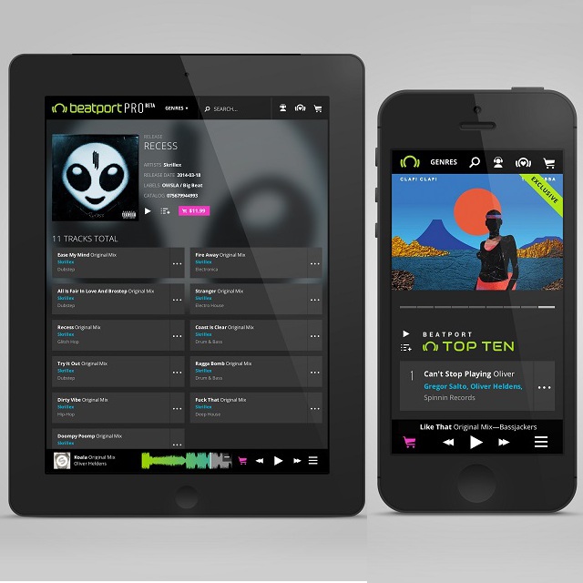
Upon seeing Beatport Pro, you probably will notice the different layout and color scheme of the site. The site features new styles and a high resolution display that is based around simplicity. Beatport Pro has put emphasis into simplifying the artist page to focus more on the latest releases and top tracks rather than the artist bio and information.
The new UI also includes improvements on the DJ charts, featured artists and charts, hero images, the top 10, expansion to top 10 releases, and featured sounds.
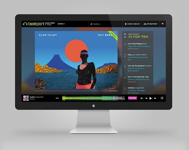
One change that has always been a complaint of mine is the audio player, now moved to the bottom of the site with a new control layout (zoom, scrub, open, ect.) and controllable using keyboard shortcuts. Keeping with the theme of simplicity, Beatport Pro offers a cleaned up cart design that is much easier to read, view, and manage tracks.
Beatport Pro Can Go Worldwide
Thanks to a complete new web design, Beatport Pro is more accessible on mobile phones, tablets, and more, which allows for DJs to search for a song and purchase it where ever, whenever. The new site and coding behind it makes the whole Beatport Pro platform much more responsive to a wide array of different devices. The mobile experience allows DJs to dig for tracks while they are riding the bus, waiting in line, or even in the club before their set.
Beatport Pro: Evolving and Adapting
The new Beatport Pro is a step in the right direction for the online music marketplace. The music industry is constantly shifting and Beatport wants to do the same because as music changes so does technology. This new site design offers much needed stability and accessibility that the old site started to lack.
While the change will eventually become the new home for Beatport’s music collection, users have the option to seamlessly switch between both for a limited time, and anyone can feedback via Uservoice to contribute to the workflow of the site. Beatport Pro went live September 15th – check it out now.
What are your thoughts on Beatport Pro – is it an upgrade to the old site?


